
Hey! I'm Matt.
I specialize in logo, icon, and book layout design (primarily for tabletop games).One of TheMemorySlot's core values is the presentation of complex data through simplified visual communication; this is reflected in all of my work, whether it be for my personal projects or commissioned designs.My clients have no need to second-guess; on top of ensuring that you receive a quality design, I also provide consultation, ideas, and feedback so we can jump straight to fulfilling your vision.So what are you waiting for? Let's make something amazing together!
I am currently available for freelance work/commissions.

Matthew Schuff
Creative Designer, Video Producer


Project Credits
Henshin! A Sentai RPG (Cave of Monsters Games, 2020, 2024) | DIY Module Layout, The Guest Stars Expansion Logo and Module Layout
Rider Konchu (Cave of Monsters Games, 2023) | DIY Module Layout, Logo, Project: HARDHAT Module Layout, Logo, and Editing
Elements of Procedure (Cave of Monsters Games, 2024) | Logo, DIY Module (Assignment Brief) Layout
Over Arms (Rookie Jet Studio, 2022) | DIY Kit
Red Giant (Rookie Jet Studio, 2024) | DIY Kit, Of the Mist Expansion Layout
Final Fantasy TRPG: Legend Edition (Monastic Entertainment, 2025) | Art Direction, Editing, Graphic Design, Layout (Sheets, Bestiary, Ultimania Expansion), Web Page Design
Periscope Films (Film Production Company, 2025) | Logo, Branding, Business Cards
Brand logos
Not all logos are part of a brand package. This is a collection of stand-alone logo commissions from a variety of clientele.
Ecodisc
Client: Sebastian Stefanoff (EcoDisc, YouTube)
EcoDisc is an online video series that combines the sport of disc golf (frisbee golf) with educational facts about the environment, typically in relation to what is found at the disc golf course in each episode. My client had also been in collaboration with Doomsday Discs to help promote their discs made from recycled landfill plastic. With this in mind, I needed to make a design that not only accurately portrayed my client's brand, but also displayed a sense of consummate professionalism to help strengthen the bond between the client and his sponsorship.I knew that a disc had to be incorporated into the logo from the beginning, so I started with that imagery and built the rest of the design around it. The shape of a disc lends itself well to replacing the 'O' in 'Eco', so placement came naturally. A clean, modern font lends itself well to promoting a look the evokes both a 'sporty' and 'eco-friendly' feel. The text is then italicized to simulate a sense of motion to coincide with the image of the disc being thrown "through" the text. Imposing the globe over the disc seemed like a natural fit, once again combing the 2 primary aspects of the brand. Leaves were added as a final touch, both to further reinforce the nature theme of the brand, but also to create the illusion of the disc bursting through foliage, like bushes or trees.


cave of monsters games
Client: Sam Kusek (Cave of Monsters Games)
Rider Konchu is a tabletop roleplaying game inspired by the Kamen Rider series. Sam granted me creative liberty on the logo, only at the request that is isn't trying to replicate any existing Kamen Rider logos. This presented the challenge of creating something that captured the spirit of the source material without leaning too heavily on existing visual tropes; a unique perspective. I went with an angular font to reflect the action-packed nature of the game and it's inspirations, shearing it to an italicized shape to simulate a sense of motion. Stylizing the "O" as a gear perpetuates the game's primary gimmick (special items called "Gears") and plays into the technological and vehicular aspect of the source material. A faded hexagonal pattern evokes the imagery of tire tracks and the compound eyes of a grasshopper.Elements of Procedure provided a refreshing change of pace as it's source material was one I was not inherently familiar with. Another tabletop roleplaying, however this one is an investigation-centric title inspired by the British television series Sapphire & Steel. Similarly to Rider Konchu, Sam explicitly requested a departure from the source's logo design, instead focusing on the unique qualities of Elements of Procedure. This led to a relatively simple compromise; a simple typeface similar to those used in the book's layout with certain letters replaced by icons representing various features and core ideas from the game. Sometimes, less is more.In addition to the logo, I was also tasked with creating a custom Assignment Brief PDF, with fillable fields so players can easily create their own adventures within the format of the game. This was a wonderful opportunity to interact and work with the elegant layout style designed by the talented Jean Verne as I attempted to maintain a consistent look with the core rule book.
Rider Konchu and Elements of Procedure are available in digital format here.


Sprited
indie comic & Youtube channel
Client: Zack Whoolery (Sprited, YouTube)
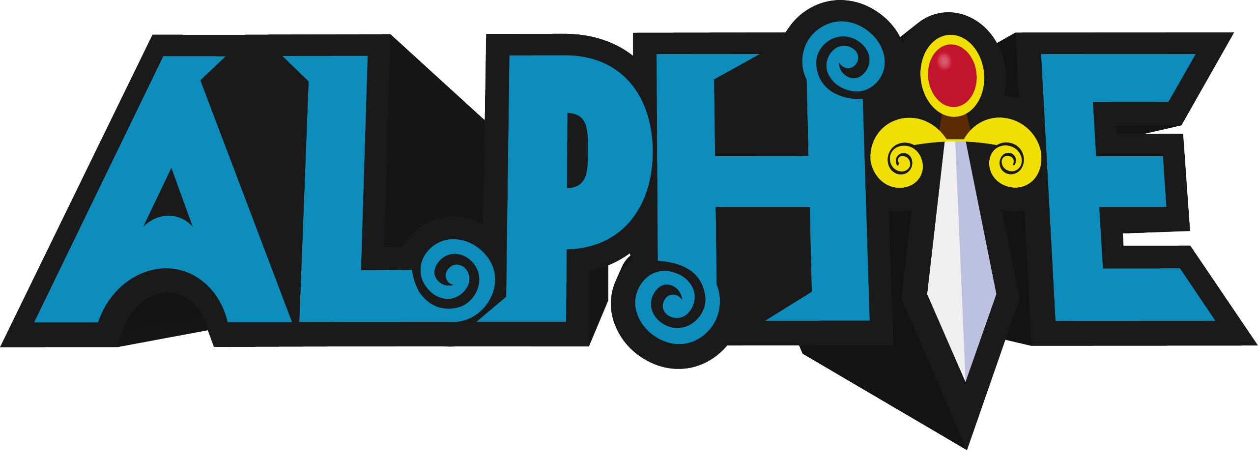
Alphie: Once and Future is an ongoing web comic from Zack Whoolery and Josh Hardy. It's a satirical take on Arthurian legend inspired by console RPGs and Saturday morning cartoons. In order to capture the essence of the art and tone of the comic, I deliberately went for a low-detail "cell-shaded" look, taking major inspiration from 2000's era cartoons and 80's era fantasy video games.Internet Interest is an online video series exploring various internet-based oddities, from eccentric individuals to bizarre communities. No particular requests were made for this logo; I had full creative freedom. Due to the broad approach to subject matter the series has, I thought it best to keep it simple, while still playing into a computer theme. "Internet" and "Interest" are spelled almost identically, so it naturally led to a design that aligns the two words in exact unison, merging the I's and T's. A single underscore sits to the right side of the logo, simulating a typing bar on an old computer terminal or command prompt.
Alphie: Once and Future is available in digital format here.

final fantasy tabletop roleplaying game: legend edition
Client: Monastic Entertainment
My Roles: Art Direction, Graphic Design, Layout, Editing
The Final Fantasy series has had a shockingly dense number of fan made tabletop roleplaying games made since the mid 90’s, each one bringing a unique perspective from their respective developers in an attempt to capture what they believe to be the spirit of the franchise. When Mildra approached me with his own spin on this time-honored tradition, I was instantly captivated by the desire to pull inspiration not only from one particular game, but every corner of the Final Fantasy series.Final Fantasy is an anthology series; every entry tells a different tale, each one set firmly in its own continuity. In order to craft a game that marries all of the series’ various ideas into one cohesive package, Mildra and his co-developer needed to take a setting agnostic approach. This mindset would serve as the basis for the design philosophy I would apply to the game’s visual identity; rather than pulling inspiration from game-specific elements (like menus and UI), I instead opted to point the book’s art direction towards the Japanese game manuals and art books (Ultimania).Naomi Hunter (NamiNomi) created the layout for the core book with this art direction in mind, and through consistent and efficient communication, we were able to establish a look for the game that both pays homage to the source material while also allowing the reader to imagine any hypothetical setting, whether it be an existing Final Fantasy world or one of their own creation.


To supplement this bold art direction, I provided most of the icons that are used throughout the book. A majority of them are simply recreations of existing icons from various Final Fantasy titles, but due to Legend Edition's astronomical scope there were some extra niches that needed to be filled, and thus creative liberty was necessitated.One aspect that I offered of my own volition was the inclusion of unique icons to denote the various playable Jobs represented in the game. Job icons have only been utilized by a handful of official titles, namely Final Fantasy XIV Online and Stranger of Paradise: Final Fantasy Origin, the former of which featuring designs that are rooted in the game's lore. I wanted to implement a universal set of icons that could easily be applied to any setting, while still being recognizable on their own. The direction for these icons combines elements from the aforementioned titles, marrying the box design of XIV's emblems with the icon designs of Stranger of Paradise. As a result, many icons were lifted directly from Stranger of Paradise, with the remaining Jobs unique to Legend Edition taking heavy inspiration from that design style. Each color denotes the Class each set of Jobs is associated with (the sole exception being the purple icons, which are independent and do not have an associated Class).

Legend Edition includes a fully detailed bestiary loaded with sample monsters from the series' history. Since laying it out was such a massive undertaking (and Naomi was already facing an overwhelming workload with the core book's layout), I offered to take the reigns on laying out the stat blocks for this section. Due to the sheer amount of stat blocks that were needed (25 in the core book, and a whopping 200 in the monster manual!), I opted to create a universal format that could accommodate each and every one of them. This arrangement is heavily inspired by console RPG strategy guides, like those for Pokémon, Shin Megami Tensei, and Final Fantasy itself. Approaching the bestiary in this manner allowed me to present all of the required information for each monster without over-cluttering the pages or needlessly increasing the overall page count of the book, while still leaving sufficient room for images and flavorful descriptions.

Another one of my responsibilities on the project was the creation of print-out character sheets and party trackers. To coincide with the agnostic approach of the book, I kept these relatively simple with a focus on practicality and ease of use. Spared usage of icons and colors helps to easily identify some of the most vital statistics on the sheet at a glance, and the formatted headers break up each section without breaking cohesion. This direction also allowed me to create the multitude of other sheets without much guesswork (there are a total of 9 pages in a single "Character Keeper", as well as 10+ add-on pages for optional rules; players build out a packet based on the needs of their characters and the rules of the current campaign). This ease of workflow was especially imperative when it came time to add the fill-in fields (seen in the right image), a process that only lasted 2 work sessions despite dealing with nearly 20 pages overall.

")
The greatest challenge and grandest undertaking of the project was the complete creation of the Ultimania, a 150+ page gameplay expansion for Legend Edition. Mildra had already written a vast majority of the document by the time I joined the project, and him and I shifted our full focus to it while Naomi was busy tackling the core book's layout. Due to her absence, I had to assume the responsibility of laying out the book (nearly in its entirety). The Ultimania presents it's content in themed chapters, and this presented the unique challenge of adapting the layout's art direction to reflect each chapter. Not only was this my first time creating a full-length book layout, but I also had to adapt the character and paragraph styles of the core book in order to maintain brand consistency between the two documents. However, what seemed like an insurmountably daunting task at first would quickly become one of the most fun projects I've ever had the pleasure of working on, each chapter presenting a new puzzle for me to solve in terms of how I would handle presentation, from creating tables that resemble mechanical screens to a chapter layout inspired by the department store catalogs of yesteryear.


To further reinforce the themed chapters, I created unique covers for each. Not only do they thematically align with their respective chapters, but they serve as visual breaks, giving the reader a moment to adjust to the oncoming shift in style.


Final Fantasy TRPG: Legend Edition is available in digital format here.
D.I.Y. Modules
Client: Cory Burns (Rookie Jet Studio)
Following the full release of Cave of Monsters Games' Henshin! A Sentai RPG, I created an interactive "Do-it-yourself" template following the official format of the game's modules. Henshin's modules are concise; a cover page and a single interior page for details. Rookie Jet Studio's Cory Burns caught wind of this and requested a similar treatment for two of his titles: Over Arms & Red Giant. Both games are substantially more mechanically involved than Henshin, and thus required a complete layout overhaul to accommodate the customizable fields.
")


")
Over Arms and Red Giant are available in digital format and print here.
Testimonials
Zack Whoolery (Sprited, YouTube)
"Matt is an excellent artist to work with. His speed and work ethic really impresses me! He's been my go-to guy whenever I need a graphic for my YouTube channel, and he walks me through the entire process in case I want any changes, all while getting the final product to me as soon as he possibly can while never sacrificing quality. It's been awesome to work with Matt over the past few years and I hope to continue to work with him for years to come!"
Mildra the Monk (Monastic Entertainment)
"Working with Matt is a great exercise in collaboration, especially when it comes to translating an idea into something tangible. Multiple times he surprised me with directions I didn't even know I wanted, but were welcome nonetheless. I would highly recommend him for any and all of your graphic design needs, especially if you have a particular vision in mind."
Sam Kusek (Cave of Monsters Games)
"Matt is a true professional when it comes to layout and logo design. He’s helped me to navigate some complex design needs and has done it with sincerity, honesty, and solid communication."